Nook
Nook is a new RSS feed application that aims to simplify content aggregation from various publishing platforms.
The aim was to create a modern and user-friendly web application along with a visually appealing landing page and a unique logo.
My role
UX/UI designer
The Problem
Finding balance between readability and aesthetics
The design challenges for a web application like Nook involve finding the right balance between aesthetics, functionality, and usability. User interface design should prioritize readability, customization, and ease of navigation while considering user preferences. Additionally, addressing issues related to performance, accessibility, and internationalization is vital for creating an inclusive and user-friendly experience.
How might we enhance content aggregation and user engagement in Nook's web application?
The Solution
Seamless discovery and intuitive feed management
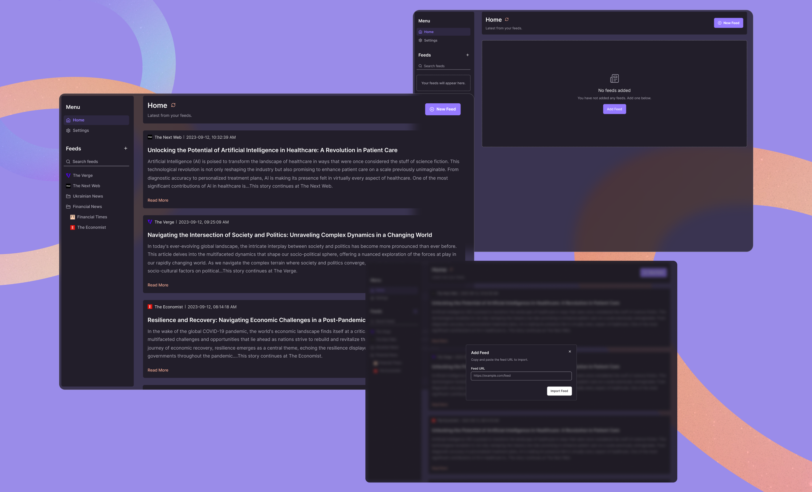
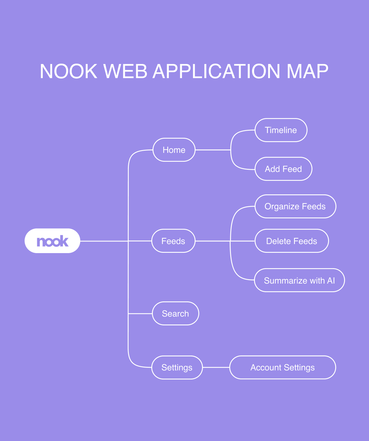
Ensuring a seamless and intuitive reading experience
Nook's design revolves around a user-centric approach, ensuring a seamless and intuitive reading experience. The application simplifies the process of subscribing to RSS feeds, making it easy for users to discover and follow their preferred sources. Additionally, Nook's design facilitates efficient content management, allowing users to categorize and prioritize their feeds effortlessly. The application features a robust search functionality, ensuring that users can quickly locate specific posts or topics within their feeds. Furthermore, Nook employs AI-powered summarization to offer users concise insights into articles, saving time while maintaining valuable information. Overall, Nook's design places a strong emphasis on user-friendliness, organization, accessibility, and content efficiency, making it an ideal choice for RSS feed enthusiasts seeking an enhanced reading experience.
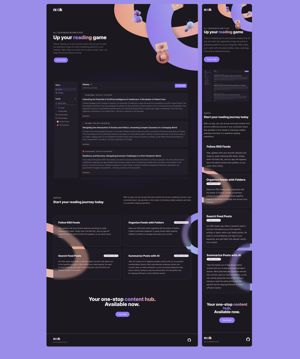
Landing page that compliments the product
Our landing page for Nook's web application embodies simplicity and clarity, mirroring the intuitive design principles found within the app itself. The page showcases a sleek mockup of the Nook application, providing visitors with a glimpse of its user-friendly interface. The design ensures that visitors can quickly grasp the value proposition of Nook and understand how it can enhance their reading experience. With a prominent download button strategically positioned for easy access, users are encouraged to take the next step and experience Nook firsthand. Overall, our design solution focuses on clarity, accessibility, and effective communication of Nook's unique features to drive engagement and conversions.
The Process
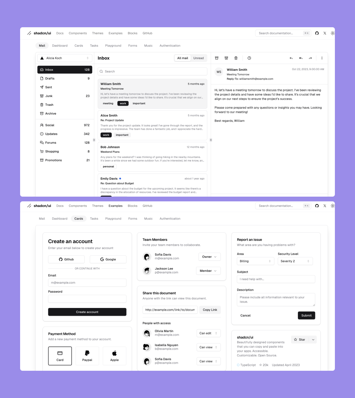
Streamlined development using premade UI library
We opted to utilize the Shadcn/UI component library for this project due to its comprehensive set of pre-designed UI elements and components. By leveraging this library, we were able to significantly accelerate the development process while maintaining consistency and coherence in the design across different sections of the application. The Shadcn/UI library offered a wide range of customizable components, such as buttons, cards, navigation bars, and modals, which helped streamline the creation of the web application and ensure a polished and professional appearance.
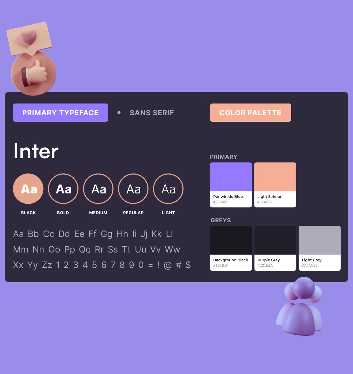
Simple but visually interesting
We opted for a dark theme in our web application to offer users a sleek and modern aesthetic while reducing eye strain, especially during extended reading sessions. The choice of the sans serif font Inter was deliberate, as its clean and modern appearance ensures readability across various screen sizes and resolutions. The accent colors of Periwinkle blue and light salmon were carefully selected to add visual interest and warmth to the interface. Periwinkle blue brings a sense of professionalism and tranquility, while light salmon adds a touch of vibrancy and contrast.