Neurofit Website
Neurofit serves as a cutting-edge web platform tailored to empower neuro-rehabilitation practitioners. I embarked on the mission to revamp their outdated website, employing the versatile Webflow platform to reconstruct and optimize the user experience from the ground up.
My role
UX/UI designer

The Problem
Enhance scientific credibility and engagement
Neurofit's previous website failed to effectively cater to its target audience of clinicians and educators who valued a scientific approach, data-driven solutions, and research-backed information. The existing design lacked the sophistication and credibility necessary to engage this audience effectively. It struggled to convey the depth of scientific expertise behind Neurofit's offerings and the reliability of its data-driven solutions. Consequently, potential users may have overlooked Neurofit's platform as a valuable resource for neuro-rehabilitation, resulting in missed opportunities for collaboration and engagement within the scientific community.
How might we enhance Neurofit's website to engage clinicians and educators with scientific credibility?
The Solution
Maintaining brand identity through polished refinement
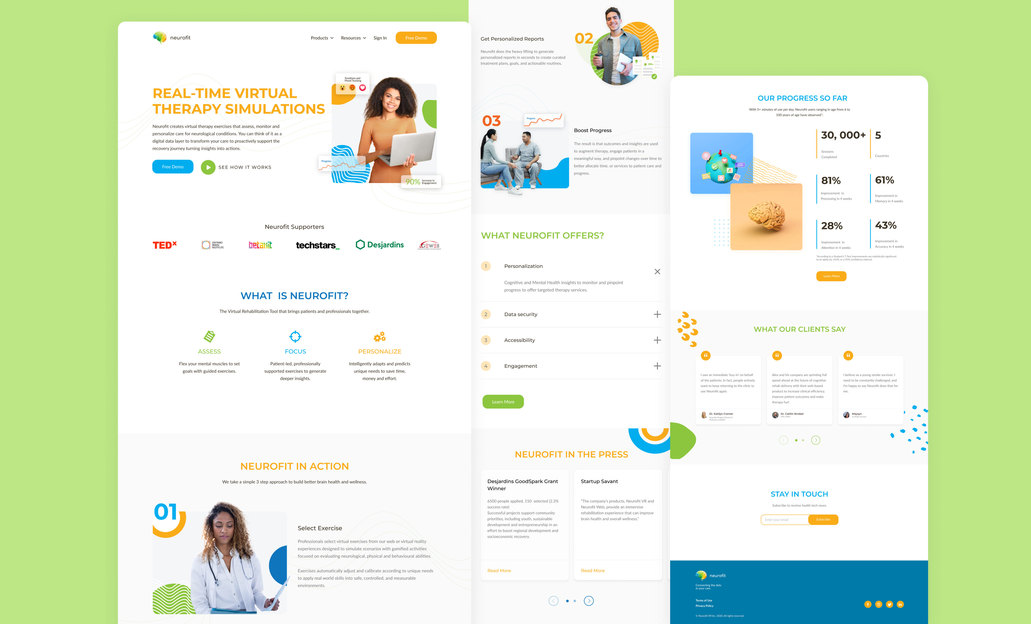
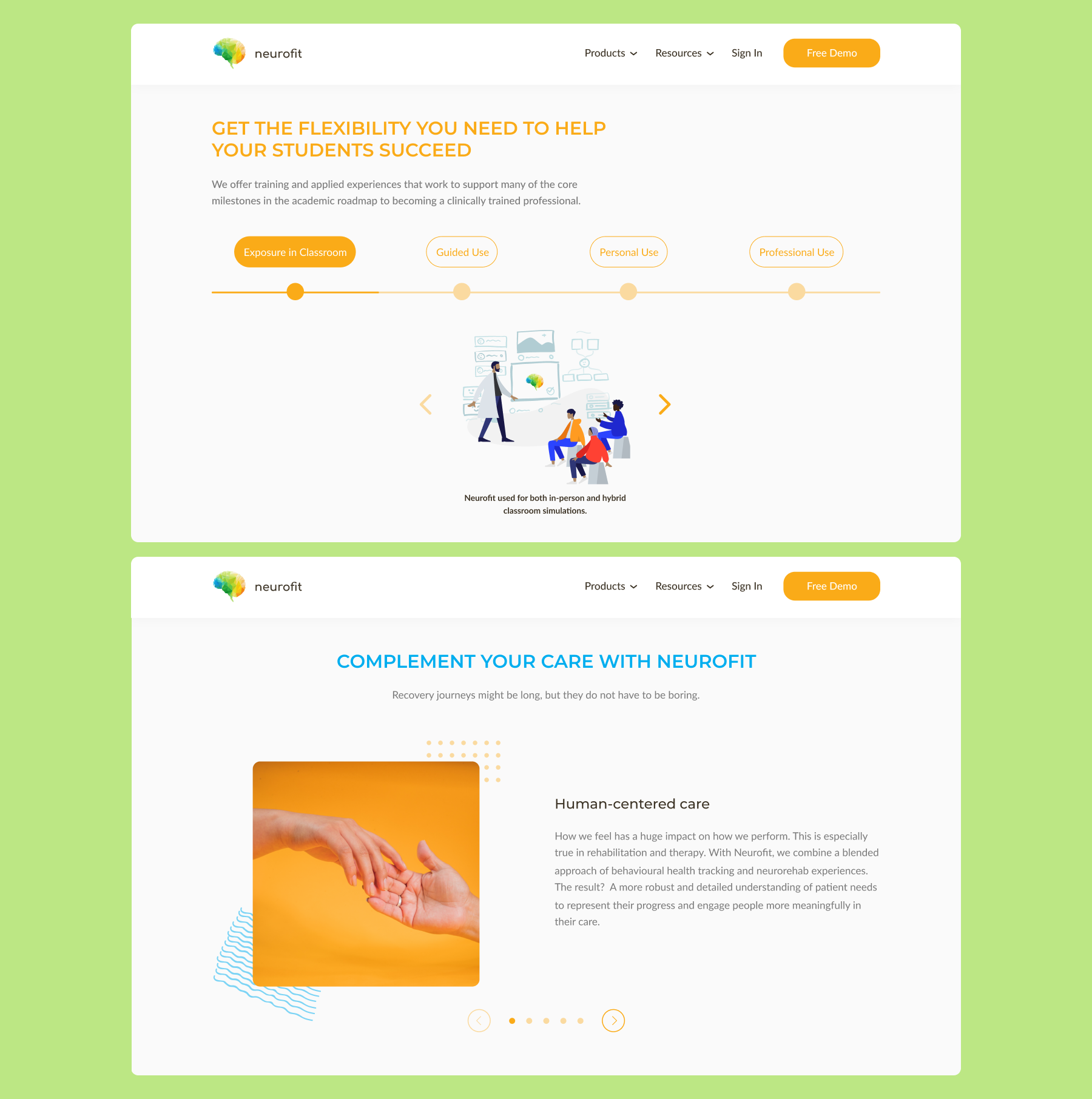
Revamp, inform, engage
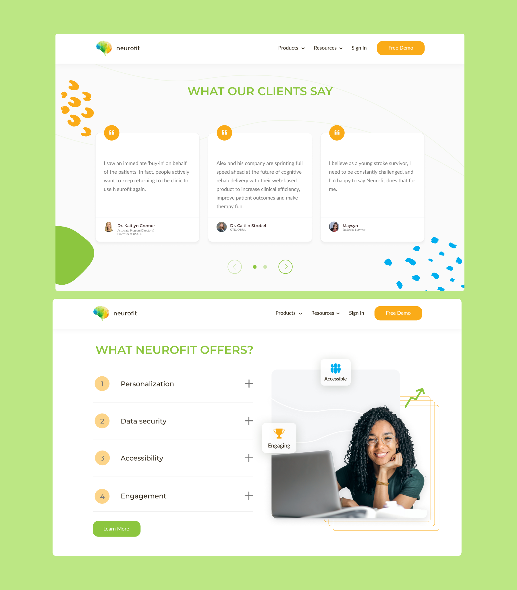
To enhance Neurofit's website and better engage its audience of clinicians and educators, a comprehensive design approach was adopted. This involved a visual overhaul, transitioning to a clean and modern aesthetic that exuded professionalism and credibility. Robust content strategy was implemented to highlight Neurofit's scientific expertise, data-driven approach, and research-backed solutions. Clear and concise messaging emphasized the platform's value proposition to clinicians and educators, ensuring relevance and appeal. Interactive features, such as case studies, testimonials, and demonstrations, were integrated to provide tangible examples of Neurofit's effectiveness in neuro-rehabilitation practice.
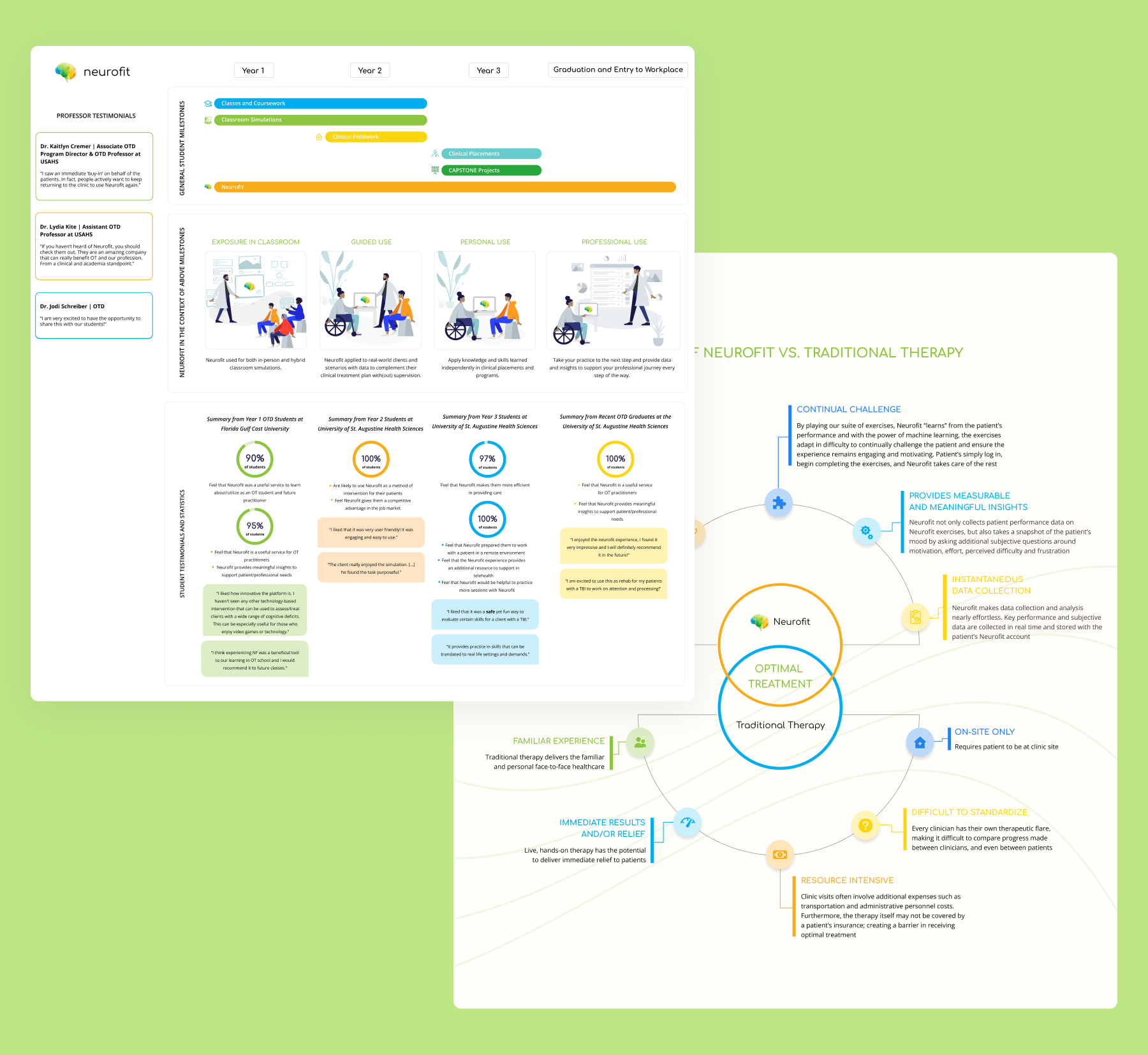
Backing up scientific approach with data visualization
Data visualization techniques, including graphs, charts, and infographics, were employed to enhance the understanding and interpretation of patient progress data and research findings. Finally, accessibility was ensured by adhering to web accessibility standards and providing alternative formats for content consumption, catering to all users, including those with disabilities.
The Process
Website transformation step-by-step

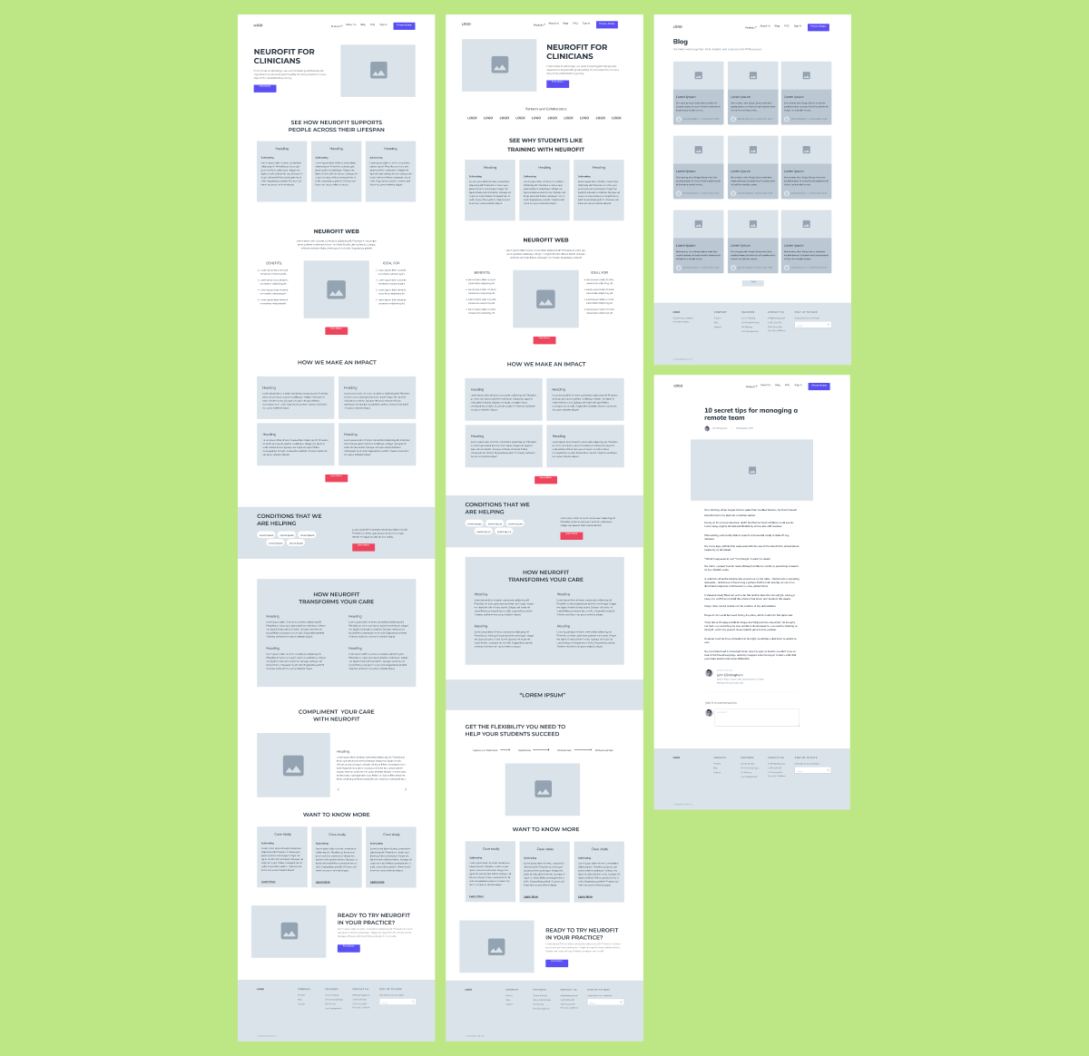
Low-fi wireframing and prototyping
The design process for this project began with comprehensive research and analysis, aiming to understand Neurofit's target audience, their needs, and industry trends. Through competitor analysis and audience research, opportunities for improvement were identified. Following this, brainstorming sessions generated ideas to enhance the website's scientific credibility and engagement. Wireframing and prototyping allowed visualization and refinement of the website's layout and structure, iterated based on stakeholder feedback and usability testing.
Visual design and development
Subsequently, the focus shifted towards developing a visual design direction aligned with Neurofit's brand identity, ensuring professionalism and credibility. Clear messaging highlighting Neurofit's scientific expertise was crafted, alongside a content strategy to present information effectively. Interactive features, including case studies and testimonials, were implemented to showcase Neurofit's effectiveness, complemented by data visualization techniques to present research findings compellingly.
Accessibility considerations were integrated throughout the design process, ensuring the website was inclusive to all users, before the final design was implemented and tested for functionality and user-friendliness on the Webflow platform.