Neurofit Dashboard
We created a web platform that equips neuro-rehab practitioners with detailed patient progress data based on a range of adjustable digital activities to support more effective rehabilitation outcomes.
My role
Product designer
Impact
Empowering healthcare
The Problem
Solving multiple design challenges with the user in mind
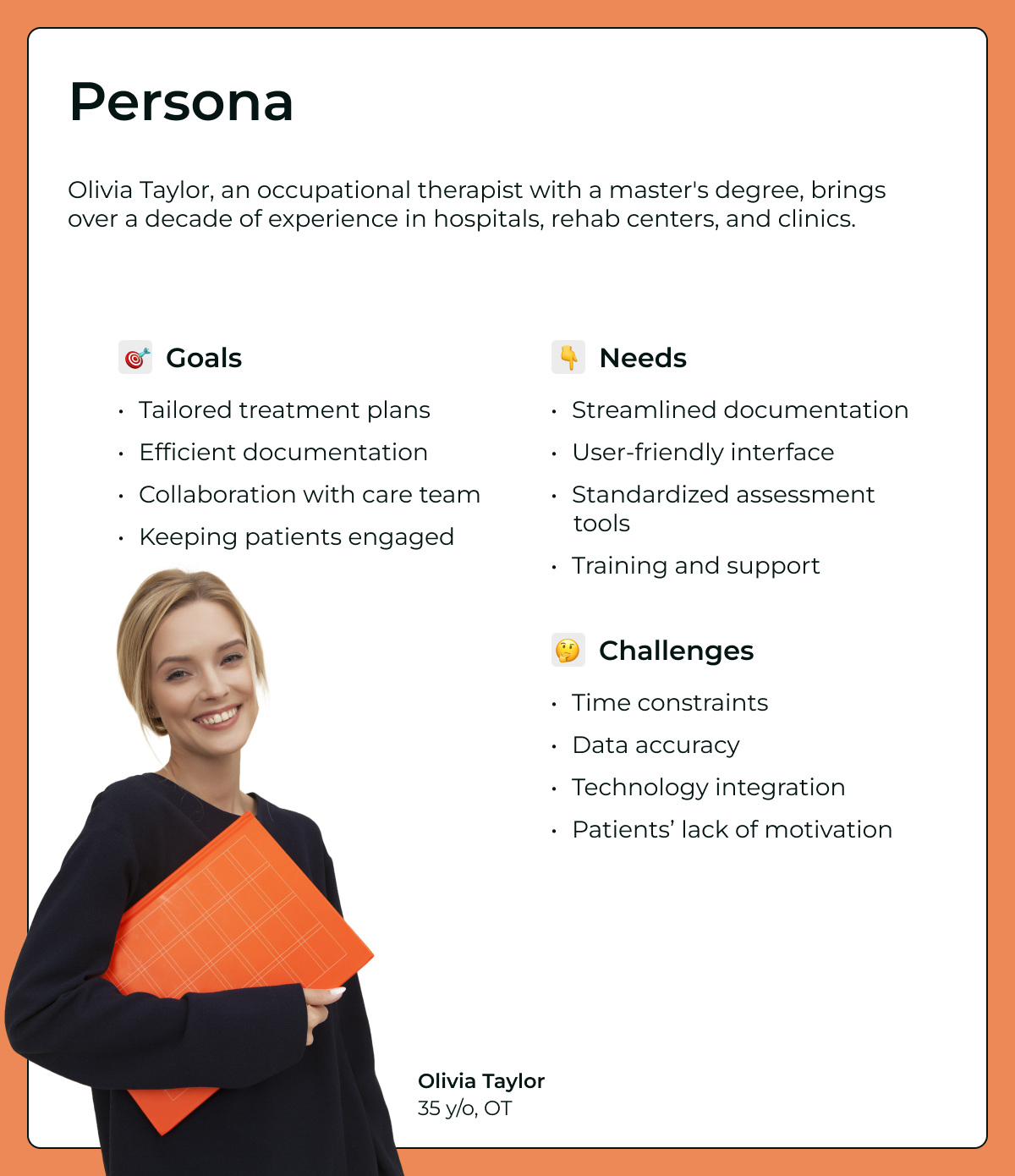
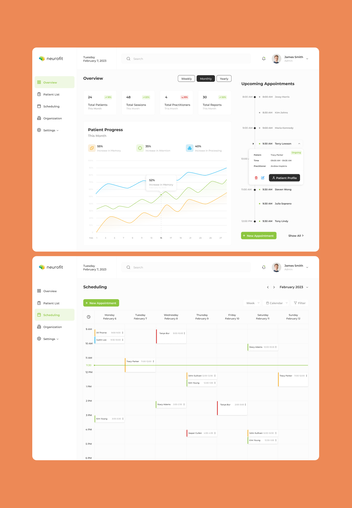
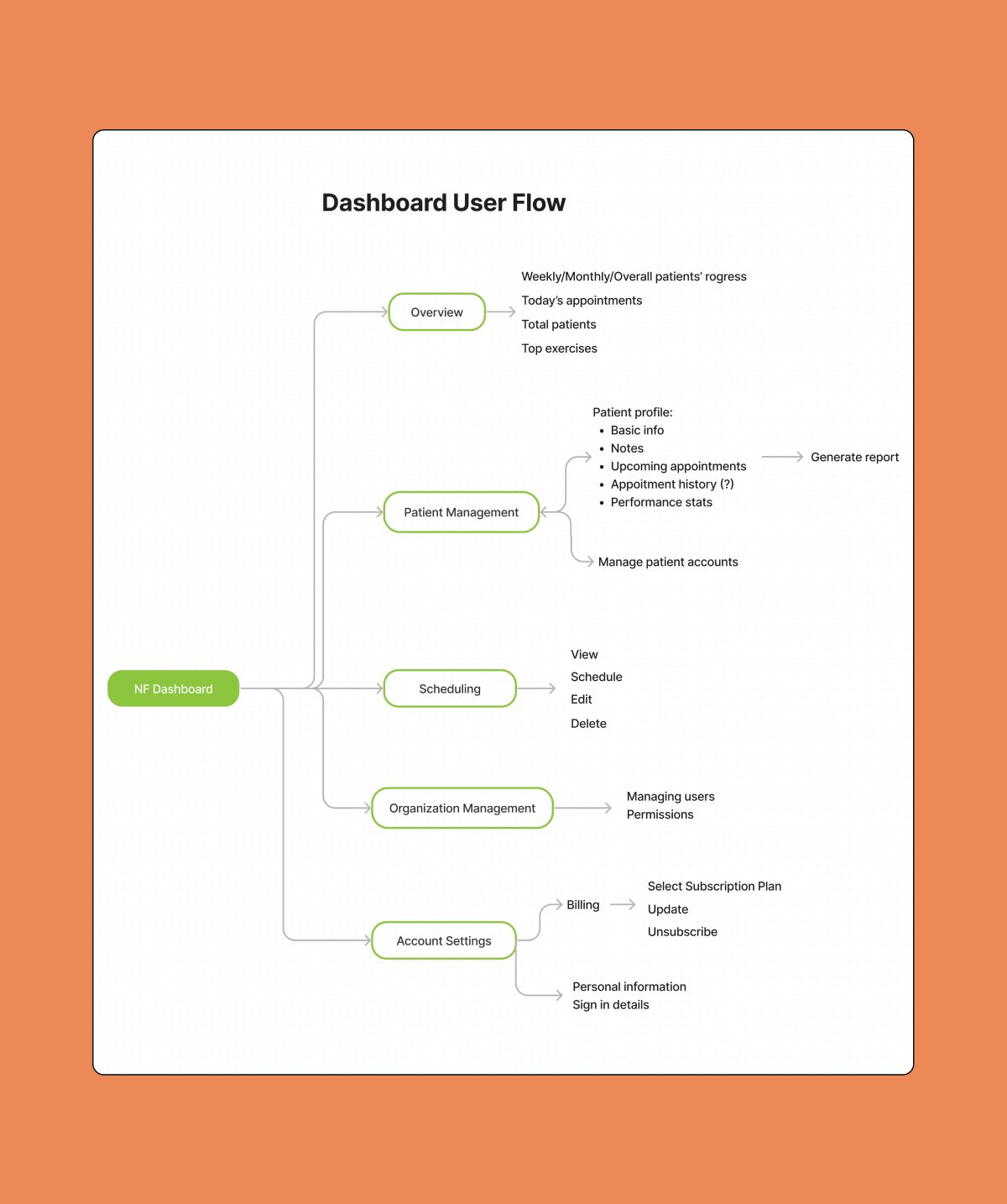
The primary aspect of my work involved developing patient dashboards, which served as the primary communication point between healthcare providers and their patients. A key objective was to create a dynamic and user-friendly interface that would accommodate the needs of medical professionals and help them to better accommodate their patient’s needs.
Furthermore, I was responsible for designing the appointment scheduling and viewing processes, as well as developing procedures for uploading individual and multiple users to the platform.
How might we create a seamless dashboard for efficient patient care management?
The Solution
Bridging the gap between traditional therapy and innovations
To address the challenges of creating a user-friendly and dynamic dashboard for medical professionals, our solution focuses on simplicity and adaptability. We developed a clean and intuitive interface that prioritizes ease of navigation, allowing healthcare providers to access vital information quickly amid their busy schedules. By employing user-centred design principles, we ensured that the dashboard's layout is intuitive and efficient, enabling seamless interaction for users with varying levels of technological expertise.
In response to the challenges posed by appointment scheduling complexities, we introduced a streamlined system aimed at simplifying the process for both healthcare providers and patients. Our solution features an intuitive interface for scheduling appointments, enabling users to effortlessly browse available slots, make bookings, and receive automated reminders. Through thorough user testing and iterative feedback, we refined the scheduling workflow to minimize obstacles and enhance usability, ultimately improving the patient experience.
Safeguarding patient information with ease
For user management tasks such as uploading individual and bulk users to the platform, our solution prioritizes security and ease of use. We developed a robust yet user-friendly interface for uploading data, incorporating encryption and authentication measures to safeguard sensitive patient information. By prioritizing data security and compliance with healthcare regulations, we ensure that user management processes are both secure and efficient, instilling trust and confidence in our platform.
The Process
From insights to implementation
Iteration, iteration, and more iteration
Our design process began with comprehensive research and analysis to understand the unique needs and pain points of both healthcare providers and patients. Through stakeholder interviews, user surveys, and usability testing, we gathered valuable insights that informed our design decisions. We identified key challenges such as time constraints, scheduling complexities, and data security concerns, which guided our solution development. With a deep understanding of the problem space, we embarked on an iterative design process, starting with wireframing and prototyping to explore various interface layouts and functionality. We conducted usability testing sessions with real users to gather feedback and iteratively refine our designs based on their insights. This iterative approach allowed us to validate assumptions, identify usability issues, and iterate rapidly toward an optimal solution.
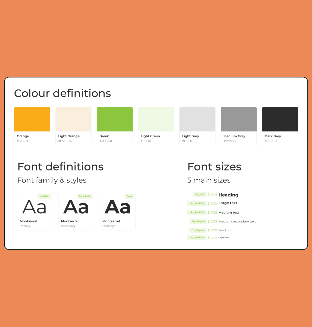
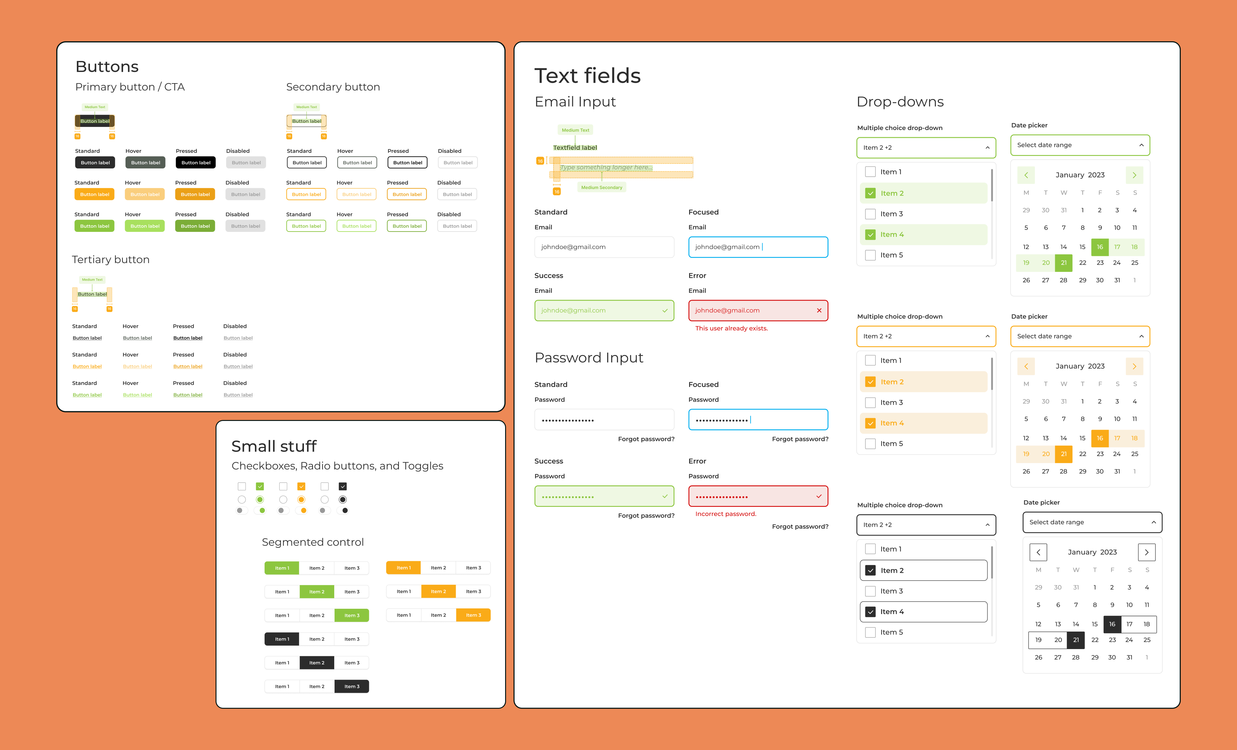
Design elements: Font, colors, and visual harmony
For this project, we chose Montserrat as the primary font, known for its modern and clean aesthetic, aligning well with the professional context of healthcare. Montserrat's versatility allows for easy readability across various screen sizes and resolutions. In terms of color palette, we opted for a combination of orange and green as accents, symbolizing vitality and growth within the healthcare landscape. These vibrant hues are balanced with shades of light grey, medium grey, and dark grey for text and secondary elements, ensuring clarity and contrast against a white background. This color scheme not only enhances visual appeal but also promotes accessibility and ease of navigation for users interacting with the dashboard.